Analysis of Titles Within a Trailer:
Annabelle (2014) (EB)
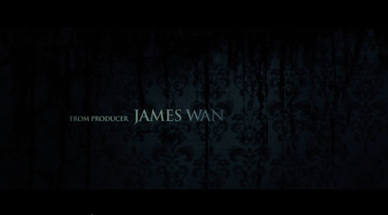
Annabelle uses a simple dull white font which looks professional and is all in capitals, a quality that can be seen in almost all horror film fonts. The light colour of the font also contrast with the dark colours of the background. The background itself is obviously supposed to be reminiscent of wallpaper, it is however torn and appears to even be dripping with a black liquid. This hints towards the theme of the films, as it is set in a typical house, but the film of course has a twist of horror. This is not only a aesthetically pleasing background but also manages to link to the genre while also hinting towards the plot.
Annabelle uses a simple dull white font which looks professional and is all in capitals, a quality that can be seen in almost all horror film fonts. The light colour of the font also contrast with the dark colours of the background. The background itself is obviously supposed to be reminiscent of wallpaper, it is however torn and appears to even be dripping with a black liquid. This hints towards the theme of the films, as it is set in a typical house, but the film of course has a twist of horror. This is not only a aesthetically pleasing background but also manages to link to the genre while also hinting towards the plot.
|
Oculus (2014) using white writing with a twist on the basic font to make it look old and worn down, makes for great titles in a horror trailer. The black background typically used in horror titles is something we do not want to do for our horror. We would prefer to use white as a symbolism of purity. This is the type of font we would like to have for our titles as it makes the horror seem more professional. (LP)
|
|
|
The Innkeepers (2012) uses a white font with a slight blur effect which has connotations with the supernatural, particularly ghosts and spirits. The use of this font gives the impression to the audience that those elements would be present meaning it would appeal to fans of that genre. for those not avidly into horror as much as to have a preferred genre the ghostly script also, on a much baser level, looks creepy and adds to the atmosphere of the trailer. (DS)
|
|
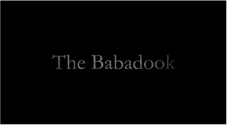
The Babadook (2014) uses a range of titles within the teaser trailer. The Babadook itself uses a serif font to stand out and be easily legible to the individual, so they can identify it from afar or just generally know that the font is to be represented with The Babadook film. The colour of the title looks grainy and rusty. This is like all horror films, as they portray dangerous and unsafe imagery, so the audience can identify horror films. Other titles within this teaser trailer are also grainy and give off a disturbed effect. (AC)
|
|
