QUESTION 2 - HOW EFFECTIVE IS THE COMBINATION OF YOUR MAIN PRODUCT AND ANCILLARY?
Prezi- Magazine, Poster, Font/Title, Main Symbol, Main Icon
Feedback from audience on products and brand identity
Feedback from audience on products and brand identity
|
|
Branding:
Branding is an incredibly important part of any film, and before we made any decisions about the way we would brand our film we decided to look at some examples of incredibly successful movies with iconic branding.
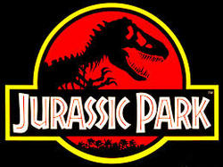
Jurassic Park is a 1993 American science fiction adventure film directed by Steven Spielberg. It is the first installment of the Jurassic Park franchise. It is based on the 1990 novel of the same name by Michael Crichton, with a screenplay written by Crichton and David Koepp. Following an extensive $65 million marketing campaign, which included licensing deals with 100 companies, Jurassic Park grossed over $900 million worldwide in its original theatrical run. The font is unique and also links in with the films park concept.
|

The Lord of the Rings is a film series consisting of three epic fantasy adventure films directed by Peter Jackson. They are based on the novel The Lord of the Rings by J. R. R. Tolkien. The films are subtitled The Fellowship of the Ring (2001), The Two Towers (2002) and The Return of the King (2003). They were distributed by New Line Cinema.It is considered one of the biggest and most ambitious film projects ever undertaken, with an overall budget of $281 million. The logo font is used in all films, and even in the newer Hobbit series. The font is links in with the fantasy genre.
|
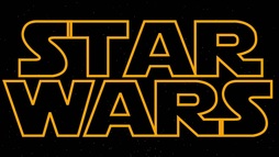
Star Wars is an American epic space opera franchise centered on a film series created by George Lucas. The film series, consisting of two trilogies (and an upcoming third), has spawned an extensive media franchise called the Expanded Universe including books, television series, computer and video games, and comic books. Though there have been six films the same font has been used throughout, and is recognised worldwide, even by those who have not seen the films. It is a very simple and minimalist font, but this hasn't stopped it from becoming so well known. |
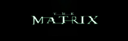
This font had a almost digital look, with the title looking as if it glitching or flickering. This links in with the word that is constructed in this films, also has the same colouring as the famous codes that take center stage in the film series.
|
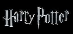
The font is sophisticated and resembles calligraphy, it is the type of font that we can imagined would have been used at a school for wizards and witched.The 'P' is also shaped into a iconic scar that belongs to the main protagonist.
|
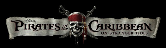
The font is bold and has an exotic theme, is also placed upon a paper banner that resemble a scroll, this links with the concept of pirates, ad does the skull and sword symbol in the middle.
|
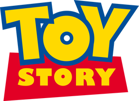
The font is made of bright, bold colours. Caters to its younger demographic. It has been used throughout all films and even on lots of the different merchandise that was released along with the film.
|
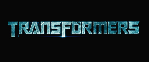
The transformers logo slightly mimics the appearance of the transformer themselves. There is also a sequence where the text itself transforms, with the metal intricately twisting into the title.
|
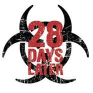
This font has a rugged and rustic theme. This links in with the films development towards an almost apocalyptic setting. The colours are also typical of horror. The background symbol is reminiscent of a quarantine sign, this ties in with the disease/infection that is a focus of the film.
|
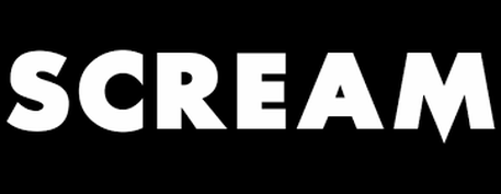
This is another very simple bold font. The 'M' however adds a slight horror twist, as it has been shaped into a sharp point. This is symbolic of the killer weapon of choice in the film, the knife. This knife is a also used in other moment of the film, for example when Casey nonchalantly plays with it while on the phone.
|
