Magazines
In order to fully research magazines we looked at the four different types of coversaction shot, staged actions shot, character and actor. We also analysed what was effective about the covers. We selected four examples of each magazine so we could examine each different layout.
(AC) , (EB)
|
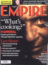
From this Horror magazine cover we can see that there are lots of features that make it effective. What I notice on lots of the Empire magazine covers is that the titles and headlines are all usually red, this could show blood and loss of purity. Half of Hannibal's face is in darkness showing that we only know half of who is and that he's maybe hiding something. Empire magazine only usually have the main character as the focal point as shown on this poster, this is called a Character magazine as shown in the prezi above. Also the use of the red in his eye could suggest he's evil inside and theres something more to him than we think. (LP)
|
|
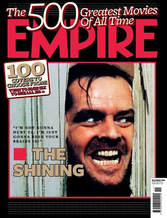
This magazine cover is slightly different from the Hannibal one, although it has the character on the cover it is not a characters magazine as the picture is taken from a scene in 'The Shinning'. You can see by the expression on the mans face that he is angry or psychotic, this gives us a clue as to what the film is about. (LP)
|
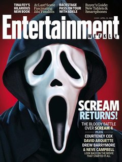
This poster is also good as it uses minimal colouring(only red, white, and black, which are all commonly featured colours of the genre) and only had one focus, the killer. We liked this as the focus as it creates a incredibly iconic image that draw the audiences attention. EB
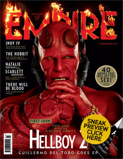
Though Hellboy may not be a horror film, this magazine as chosen to present him in a way that would suggest so, which is why we have chosen to analyse this cover, as many elements of horror are clearly displayed. For example Red and black are the dominate colours used, red which connotes blood, while black connoting darkness. The magazine title 'EMPIRE' has also been edited so it appears to be on fire. We found this interesting as Empire have usually used a similar font throughout their magazines progression, this font however is very different and unique with the addition of the flames, which are a very iconic theme in horror. eb
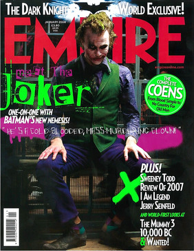
Though, again this is not a horror film it does (very similarly to our plot) have a very sinister villain who plays a main role in the story. We liked how the villain was the focal point of this poster, and though the background is certainly not uninteresting(as you can tell it is a prison) it is not intended to capture the consumers attention. The body language also helps to add to the intimidation, which is something that we wanted to mimic, we also liked how the villain is places infront of the magazines title text, as it implies importance. eb
