Poster Analysis:
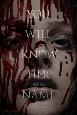
The most striking feature of this poster is a woman's face dripping with blood. The woman very pale, almost white with very minimal makeup that would detract from the her paleness. This whiteness suggests purity which is juxtaposed with the blood that stains the woman's face which suggests a loss of purity. It is also worth noting that the woman in the poster is fairly attractive and this help appeal to a straight male audience (sorry to generalise and stereotype) and help bring in interest. The striking redness of the blood ( a seminal feature in most horror advertising ) may make the poster jump out at the reader and the starkness of the colour would be noticeable against other things such as other advertisements in magazines. DS
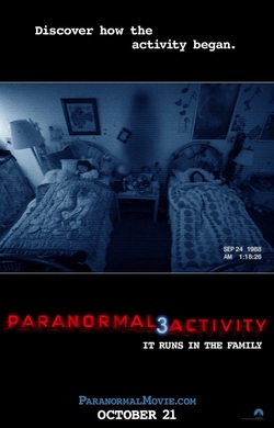
This picture is effective as it shows that danger will come to these two little girls, as there is a shadow figure standing ominously inbetween them. This will make the audience want to watch the film and find out what happens to the children. Also, it's a shot from a CCTV device, as it's grainy and the colour is blue. There is also the date and time at the bottom right of the screen to further indicate this. The title 'Paranormal Activity 3' is interesting since the red is prominent on the black and has a scattered block effect on it. The number '3' is white and shadowy to represent a ghostly appearance. It is placed in the middle of the red to separate it and make it stand out to signify that there are three movies in the paranormal chain so it must be a good film. AC
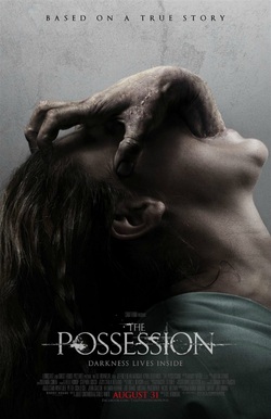
This poster is effective as it as it really grabs your attention. You can see the hand coming out from the woman mouth, it makes you intrigued to what this could mean, how it is showed in the film. The way the woman is positioned in the poster also could have some meaning behind the film, as she seems to be with her head tilted back, this could be seen as awkward and uncomfortable, like how it conventionally is in horror films. The use of colour reflects the type of horror genre it is, the poster has used dark and dingy colours, relating to death and lifelessness, this is good as you definitely able to see that it is a horror film. The use of font is very basic but usually has a twist to it, as this poster does, this is effective to the audience as you don't want to take away from the actual image on the poster. You know the film title is 'The Possession' as it is bigger than the other writing shown On lots of horror posters they use a slogan or a sentence to reflect that reflects the film, for this poster it is 'Darkness lives inside' this makes the audiences intrigued , making them want to go and see the film. LP
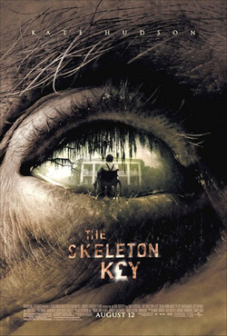
In the poster we are shown a close up of an eye. The skin around the eye resembles that of a corpse as it is dull and wrinkled. This dull colouring is common in the horror genre. However it has been edited so that instead of a regular eyeball we are shown a image of a man in a wheelchair looking at a mansion. This is the central focus of the poster as it is the lightest part and contrasts with the skin surrounding it. The brightness of the eyes also further establishes the face as a dead as it appears to be unnaturally glazed over. The audience could also interpret this as a supernatural element, as eyes of a block colour are often associated with demons and such alike in horror. The image also gives the audience a glimpse of the events or characters which may be featured, leaving the audience curious about the actual plot to the film. The title of the film is placed underneath the eye and is white with patched of what looks like blood or rust. The poster also has the name of one of the more famous actresses that is featured in the film, in order to draw in a larger audience. EB
